eCommerce Boutique-UX UI Design Case Study
The Problem
The Closet (name of the business has been changed to conserve anonymity per request of the boutique), needs a responsive website for their customers to shop from in an easy and comfortable way, online and from their homes.
Project Details
Sofia Emm: UX Research, UX Design, Journey & Empathy Mapping, Wire-framing, Prototyping, UI Design
Prototype Link
-
Grace is a busy professional woman, within the ages of 40-60, with an insatiable love for sustainable fashion pieces that elevate her style every day. She has a favorite boutique, The Closet, but she can’t shop there every month since she now babysits her grandkids in her time off. She needs a website, to shop from with ease and keep up with the latest pieces her fave boutique has to offer. She only really uses her desktop to shop, plus her eyesight gets tired with visual clutter. She does get frustrated with very busy websites. She’s excited to see what The Closet’s new website will be like!
-
Moderated interviews were conducted with 20 users (avid customers of the boutique). Interviewees were asked the same 5 questions individually via phone call.
83% expressed a need for a website to shop from to keep up to date with the boutique’s offering.
91% expressed websites today were very visually cluttered and time consuming to navigate, with too many “frills”.
95% of users shared they shop “constantly” and often call the shop to ask “what’s new in shop”.
-
User Flow has been designed as follows:
Homepage> click hero button “new in shop”> New In Shop Listing Collection Page > click a product > select size and quantity > add to bag > click check shopping bag > order summary page> click checkout > complete fields > click place order
-
10 users were part of this usability study that consisted of testing the main user flow of the website.
Unmoderated usability study with prompts to follow to complete a successful shopping session using a prototype of the website on Figma.
-
Most participants expressed they’d prefer to access the website via desktop, without having to log in - because of security concerns. Logging In features were discarded.
Some participants found the hero button “New in Shop” useful, since that is exactly what they’re looking for when they visit online shops. Features like these help users shop and access new products easier.
Most participants expressed they’d like the site to recommend them pieces. Designed the “You May Love” feature in the product page.
-
Colors for main pages have been kept black (#292929) and white (#ffffff) for best contrast and have been verified with WCAG for accessibility, as well as typography sizes.
Typography has been set to a sans serif type for legibility.
-
Wireframing and Prototyping on Figma
Google Suite for Affinity Maps, Research Summaries, and Interviewing
-
Photos are placeholders, shot by Cottonbro
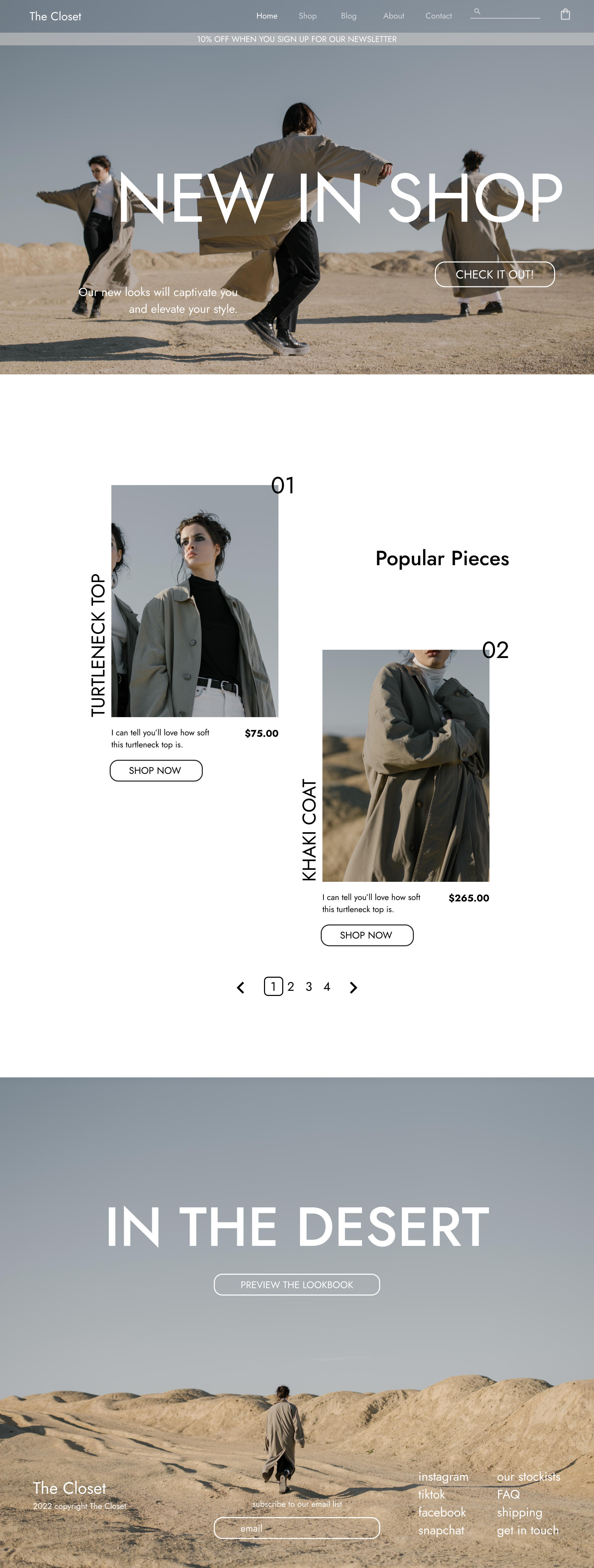
The homepage of the site showcases what users (The Closet’s customers) need to access first. Their main need is to be able to see what new pieces their boutique has to offer, and what has been deemed popular by the rest of their clientele. They’re very loyal, so most of them purchase from their collection regularly - so seeing what’s new helps them quickly keep up with the boutique’s offering.
The product page has been designed minimally, since The Closet’s users are within the ages of 40-60 and demonstrated a need for a simple and clean shopping experience. The add to cart button is large and prominent, with a contrasting dark grey background and white text.
Users suggested a confirmation that was “large” so they could easily see what they’ve just added to their bags along with a large button that prompts their next move.
Following in the style of the product page, the shopping bag page is easy to navigate. Information and calls to action are prominent and clear to avoid confusion and clutter.
Something users asked for, was for the checkout page to preview their shopping bag - so they could make sure they had everything they wanted to purchase. I designed an “In your Bag” section, where thumbnails of the items and an order summary shared info on their order, right before they committed to purchase.
Users were very vocal about a clear confirmation page, that wasn’t cluttered with text and shared shipping out times and when an email would be sent to notify them of the shipping. They also expressed need to be able to cancel an order or quickly contact the boutique in case they had issues.
For the listings collection page, users expressed they felt many sites were very busy, offering too much information in the photo captions. They expressed the visual clutter affected their vision and made it uncomfortable for them to figure out product information. I designed this product listing collection page to have the minimum info needed to be useful and display items in a visually appealing way.
This collection page specifically, was a request of the boutique. They wanted a space to share the lifestyle of their collections, a place where their users would feel inspired and connected with their pieces.
Though, most users of the site will be accessing the website from a desktop computer; many users expressed that they would still like access to the site on the go, to share things and look up pieces with their friends on lunch dates.


