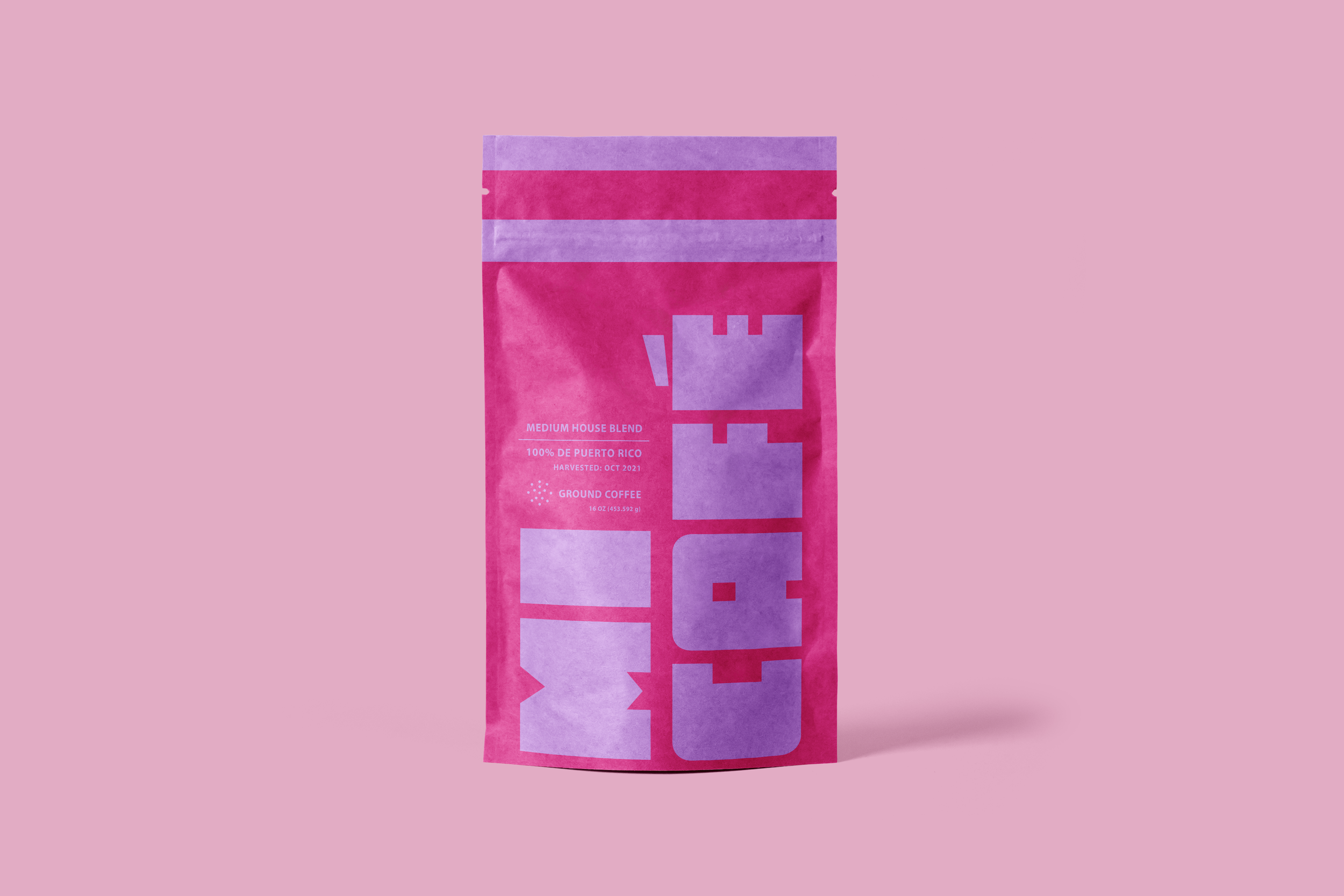
Mi Cafe Packaging
The Brief
Mi Cafe Packaging is a design challenge with the following constraints:
Minimalist Design
Contrasting colors & a limited palette
Project Details
Packaging assets, Layout & Typography
-
I wanted to design coffee packaging that I would love to display on my shelf myself! I really wanted to try out a bright hot pink and yellow, so that was my first design. The other variants came afterwards while observing the purple sky that afternoon.
The typefaces used are both sans serifs with a lot of personality. I really wanted something that was retro, reminiscent of 60s and 70s bulky typefaces, but with a blocky personality.
-
Adobe Photoshop
Adobe Illustrator
-
They’re a concept brand, of my own ideation!


