Glister-UI & Visual Design
The Problem
Glister (Amway’s oral care brand) is being restaged; needing a landing page along with Product Display Pages (PDPs) and social content for the relaunch.
Project Details
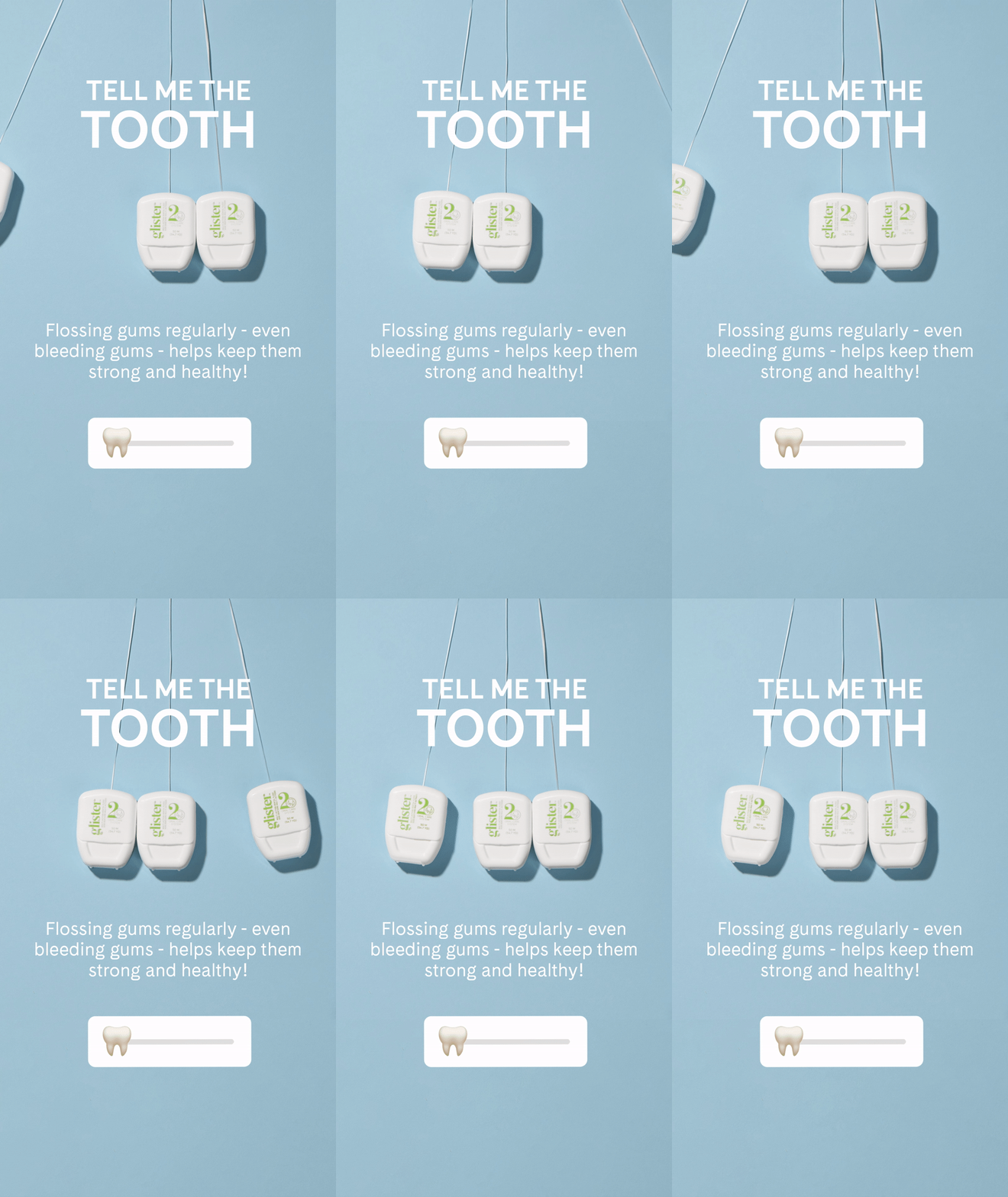
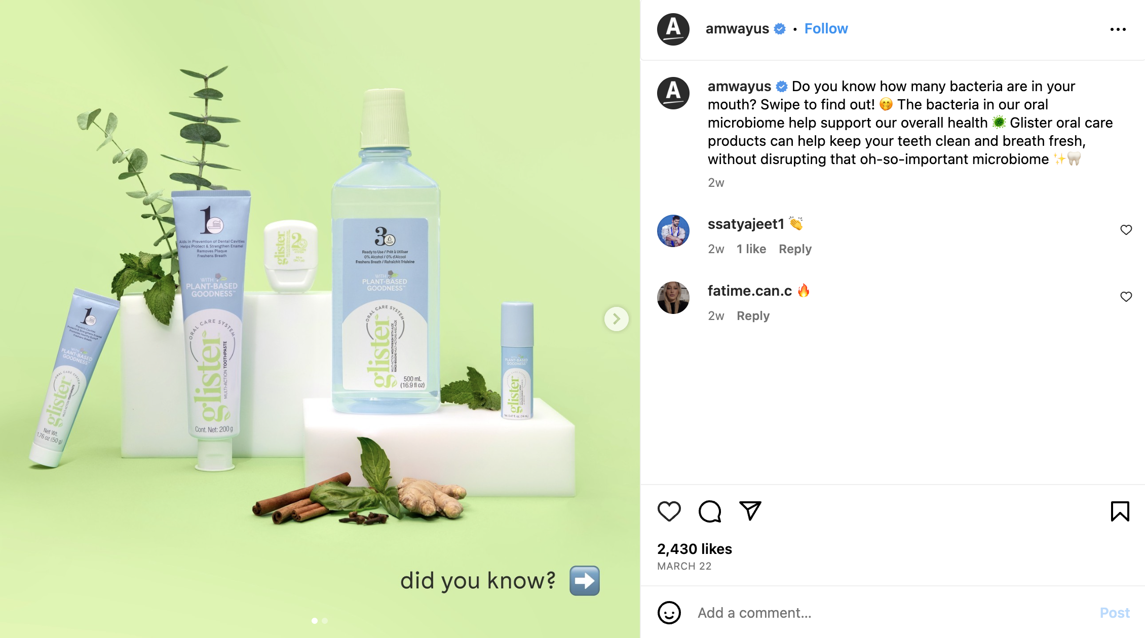
Sofia Emm: Moodboarding & Concepting, Wire-framing, Prototyping, UI Design, and Graphic Design for Content
My team members at AMP:
Jill Serron: Copywriting
David Acosta: ACD
-
Glister’s main audience are millennial moms; women that believe in providing clean, safe products for their families. They tend to research for the best products that match their lifestyle and ethos.
-
User Flow for the landing page has various starting points. Users can start by clicking on the hero “Shop now” button and be taken to the main product page; or scroll down and learn about the 3 step process and each individual product of the line.
-
Colors for main pages have been kept black (#2C2C2C) and white (#ffffff) for best contrast and have been verified with WCAG for accessibility, as well as typography sizes.
Typography has been set to a sans serif type for legibility.
-
Wireframing and Prototyping on Adobe XD
Adobe Photoshop
Adobe Illustrator
eCommerce UI Visual Design
eCommerce UI Visual Design


Social Media
Social Media


